Weekly Challenge: Retro
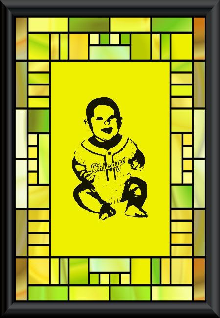
Ooh, this was tough! But it was neat. I enjoyed it. But the tut used a different version of PSP than I have, and it was hard to match up what they did. I had to change the settings a bit, but I think I still got the flavor of the challenge. With the settings they provided, it made mine all dark and shadowed. I don't know if I did something wrong before I got to the curves, or if I was just doing the curve settings incorrectly, but when I tried to duplicate the tut, it looked terrible. I moved the settings around until I got the picture back to black and white, instead of charcoal grey, then I fiddled with it a bit until you could read Chicago. Finally I was okay with how it looked.
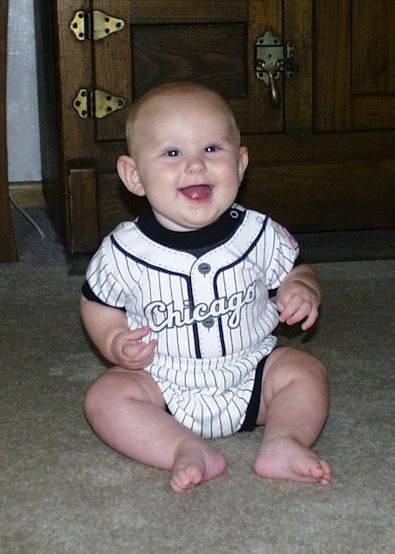
To start with, I had to erase the background on the original. It was way too dark. At the end, I did colorize a frame to use with it, or two frames, actually. It just didn't look finished to me without that. It also seemed to lesson the glare of the yellow slightly to sort of temper it with a multicolored frame. Or maybe that's just me. But I liked it better.
Tutorial Used: http://www.pinoy7.com/psptutorials/9/retro/p1.shtml
,

Comments
Post a Comment